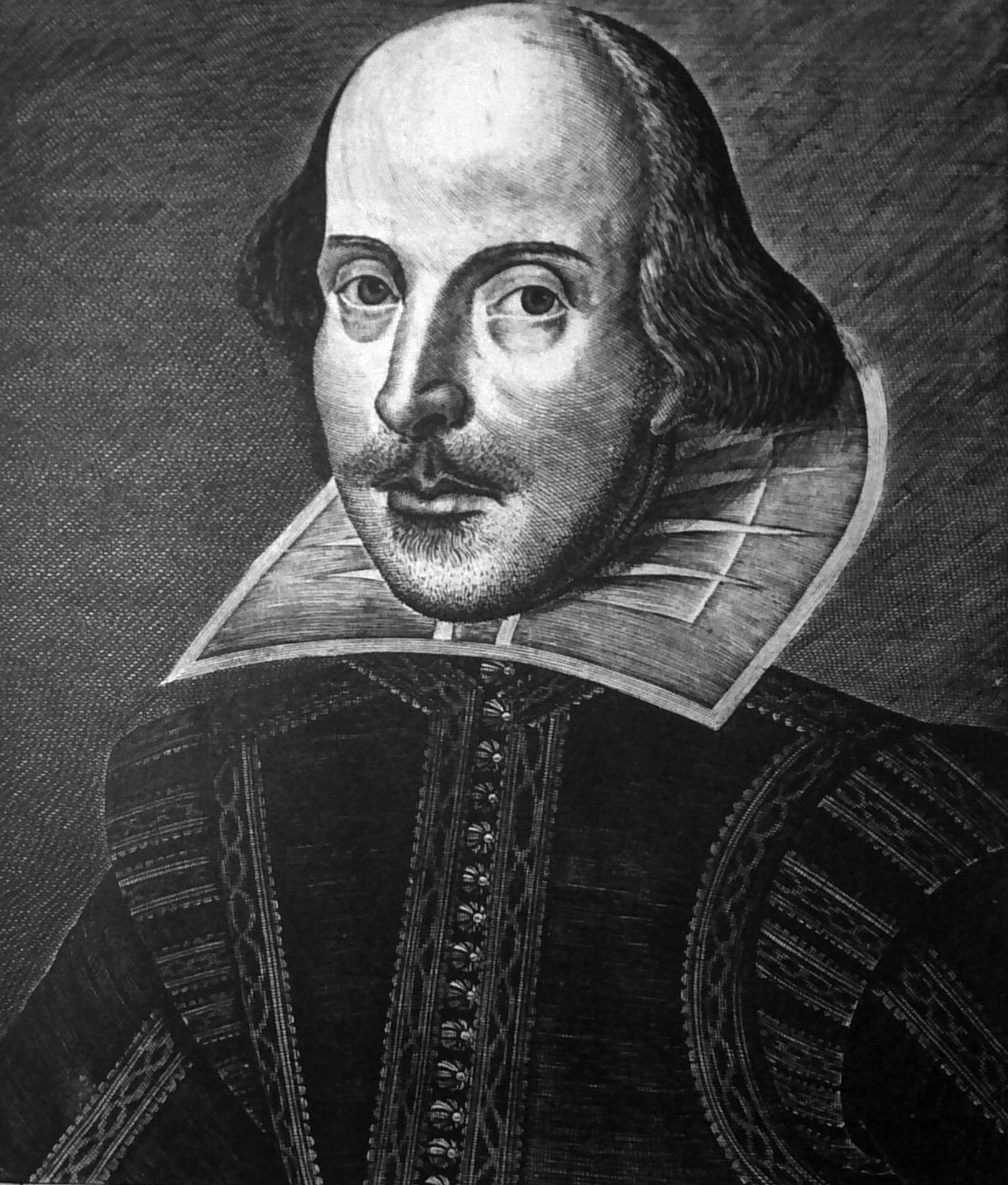


What's Wrong With This Picture?

Oversized, bulging cranium. Squint and you can really see this.
Hair poufsAsymmetrical hair poufs. At eye level on this side of the head, but down at earlobe level on the other.
MouthMouth is out of alignment with nose. Lips are centered under left nostril.
two left armsTwo left arms? Tailors have pointed out that the straight trim on this side belongs on the garment back (compare with curved trim around other shoulder). A coded message that the right arm/writing arm belonged to someone else?
side seamSide seam veers toward center buttons, making it look like the right side of the body collapses.
Eye levelUneven eyes. This eye is set noticeably lower in the face.
5 o'clock somewhereSerious 5 o'clock shadow. Rough night, Bill?
Mask LineThick non-anatomical line from ear to chin. A hint that this face is a mask?
Suit crudely drawnIll-proportioned suit. Shoulder wings are oversized and "vilely drawn," according to an early critic.
For centuries, questions and an aura of mystery have surrounded this portrait of William Shakespeare.
The image appeared in the First Folio of 1623 and ever since, engraver Martin Droeshout has been castigated for this inept rendering. The slideshow above features criticism from dissatisfied, outraged — even suspicious — viewers. Hover your mouse over the portrait to see specific points of contention.
Why all the fuss over an unflattering author portrait? This is one of only two known portraits of Shakespeare created near his lifetime.* Neither depiction gives a sense of seeing the real man, and it seems the opportunity to preserve the Bard’s likeness for posterity may have been lost.
There are two main complaints & curiosities about Droeshout’s engraving:
- It is unlike other portraits of the period. The style of the times included serious ornamentation: elegant accessories like classical pedestals, inscribed ribbons, and heraldic devices typically surrounded the authorial face. Laurel leaves are notably absent here – these were a must for writers, symbolizing intellectual accomplishment and poetic triumph. Browse our Pinterest gallery of 16th & 17th century author portraits for examples.
- It is unlifelike. Are the wooden features and clumsy details the result of a talentless or inexperienced engraver? The answer is not quite so simple – see this collection of portraits by Martin Droeshout, some done around the same time as Shakespeare’s picture. Clearly the artist could do better. Why didn't he?
The portrait inspires many questions. Why is it so crude and unusual? Why was it placed on the book’s title page, rather than facing it, as was customary for author portraits? Was it deliberately made strange?
Explore this and other Mysteries of the First Folio with Katherine Chiljan, author of Shakespeare Suppressed.
*The other almost-contemporary portrait of Shakespeare is this bust in the Stratford Church.
References:
Katherine Chiljan, Shakespeare Suppressed:The Uncensored Truth About Shakespeare and His Works
Diana Price, Shakespeare’s Unorthodox Biography: New Evidence of An Authorship Problem
